• On sale!
Tooltipy PrestaShop - opisy cech i parametrów produktów

Tooltips - product feature and parameter descriptions - PrestaShop Module

Explain technical parameters right at the product features. Add tooltips to names and values, and adjust the look of the icons and hints.

help_outlineAsk about product
Tooltips - product feature and parameter descriptions - PrestaShop Module

Tooltips - product feature and parameter descriptions - PrestaShop Module

+48 728 658 005

Zadzwoń lub skorzystaj z formularza poniżej


zł99.00 netto

121,77 zł brutto

Lowest price in the last 30 days: zł99.00

Price history

Regular price Promotional price

Instalacja ⓘZleć mi instalację modułu. Zainstaluję, sprawdzę i zweryfikuję poprawne działanie modułu.

Wsparcie techniczne

Domena ⓘPodaj adres url domeny, na której będzie instalowany nasz moduł.

Quantity

Tooltips - product feature and parameter descriptions - PrestaShop Module

A parameter such as “IP54”, “CRI 90” or “class 3” is obvious to a specialist, but not necessarily to a customer. If they have to leave the feature table and look for an explanation in a long description, the risk that they simply give up grows.

AJIT Feature Tooltip lets you add short explanations right next to the features and their values. The descriptions are managed in several languages in the back office, and the presentation can be matched to the store theme.
Key capabilities of the module

  • descriptions for feature names
  • descriptions for feature values
  • multilang
  • search and an active flag in the BO
  • js and tab modes
  • separate styles for feature and value icons
  • icon position before/after the name
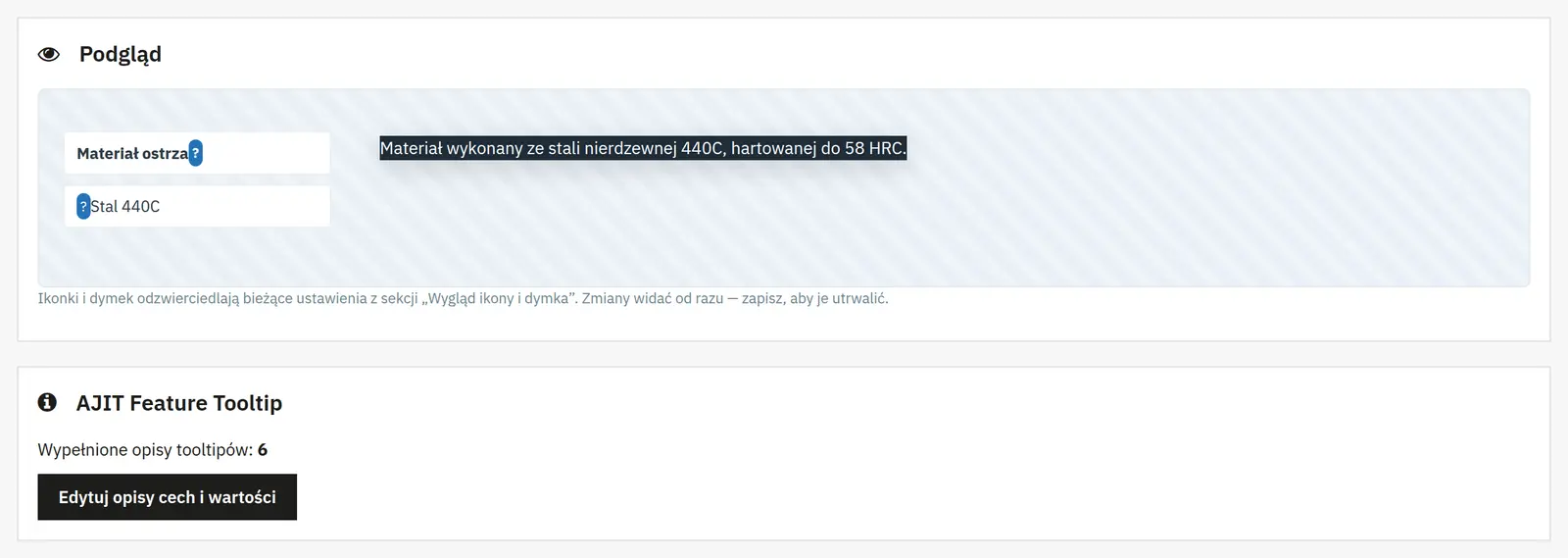
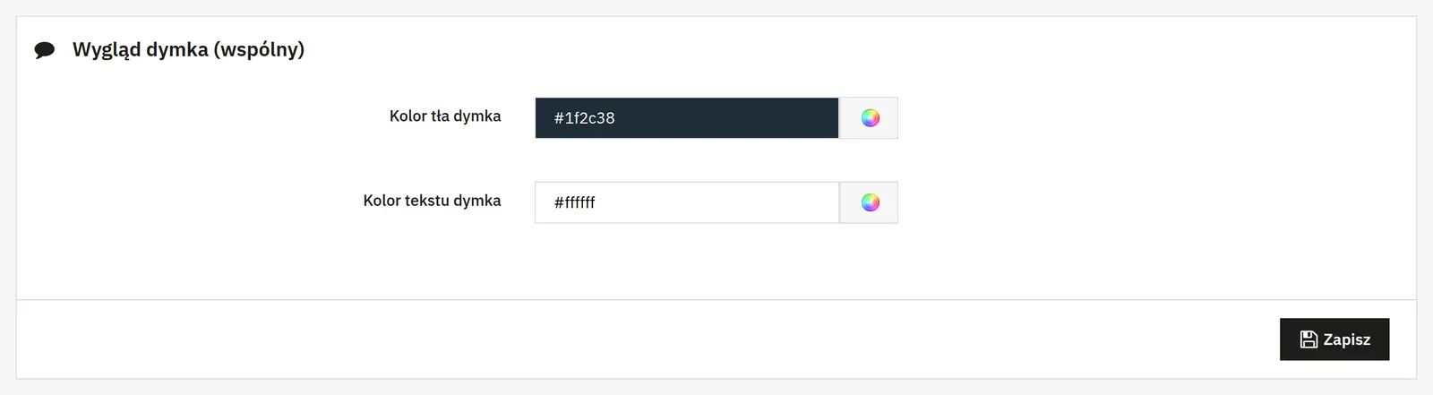
  • tooltip colors and live preview
  • auto-close on touch
  • own engine, no external libraries
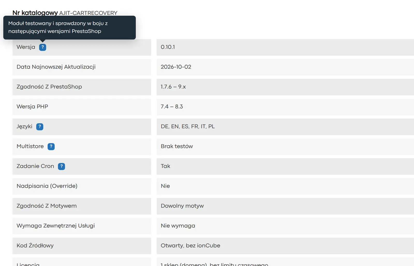
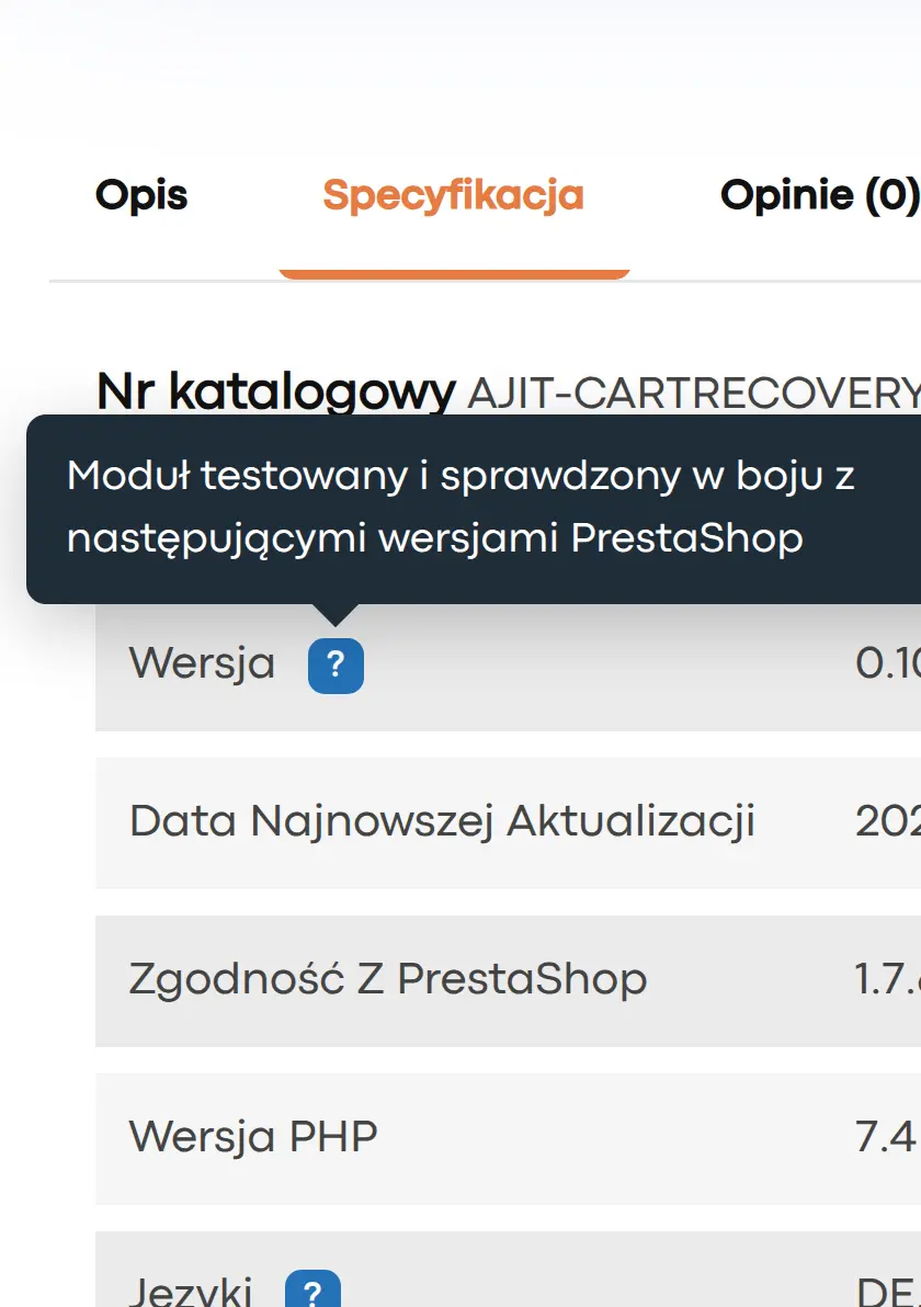
A tooltip for the feature and for the value

A tooltip for the feature and for the value

A description can be assigned to the parameter name itself and, separately, to each of its values. That way you can explain both “what the feature means” and “what this particular variant means”.
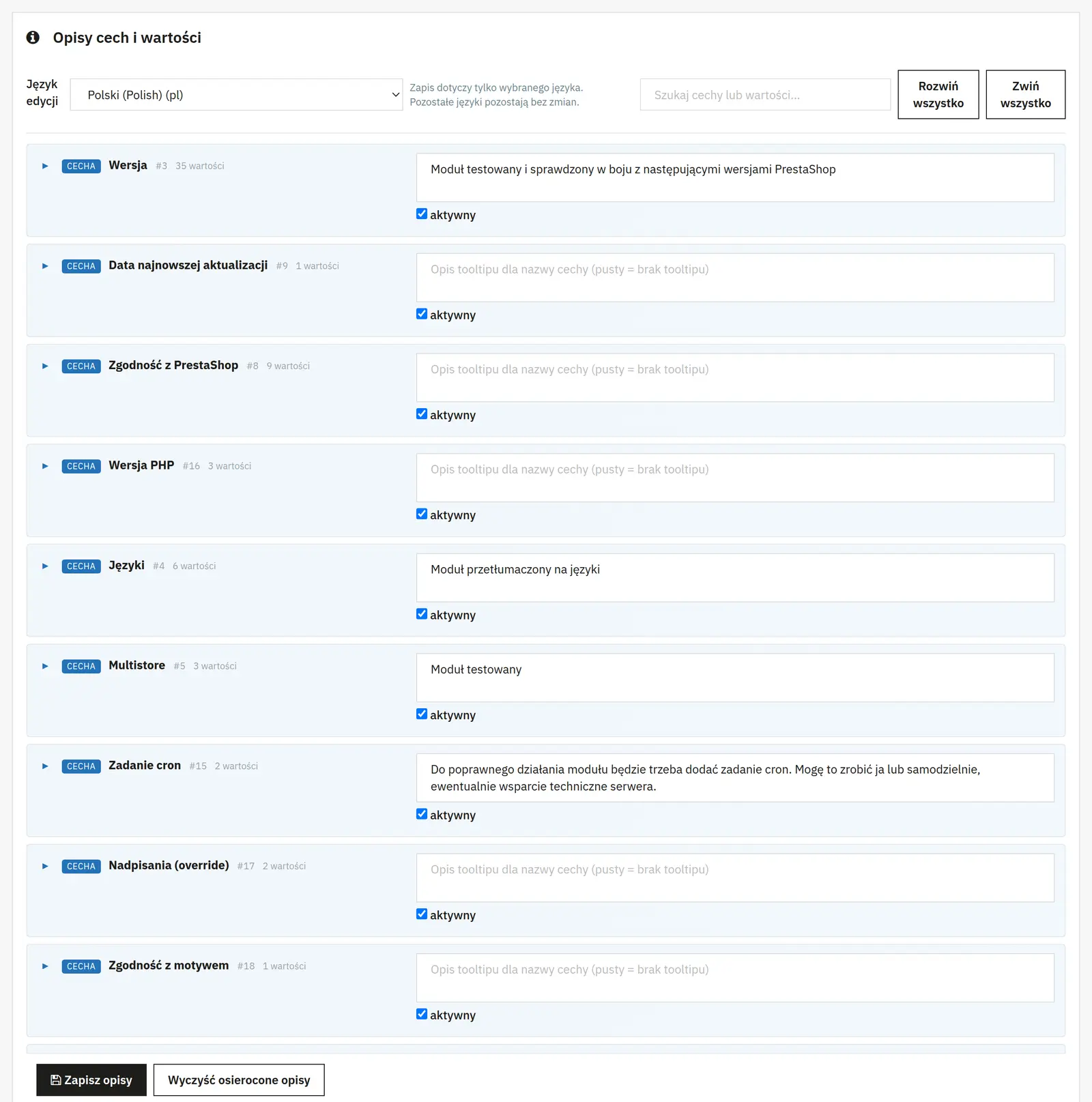
A convenient grid in the Back Office

A convenient grid in the Back Office

The panel shows a grid of features and values, with a language switcher, a search box and an active flag. This makes the work easier when there are more parameters.
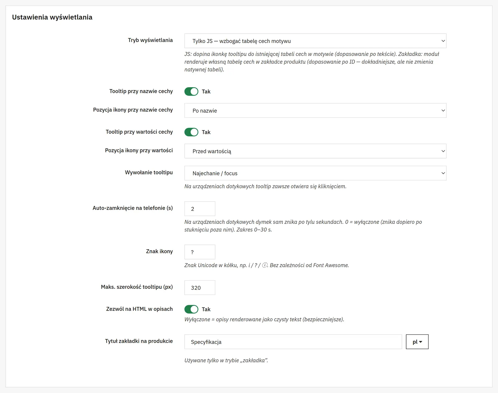
Two display modes

Two display modes

The “js” mode attaches the icon to the feature table used by the theme. The “tab” mode renders its own table in a product tab. This lets you match the way it integrates to a specific template.
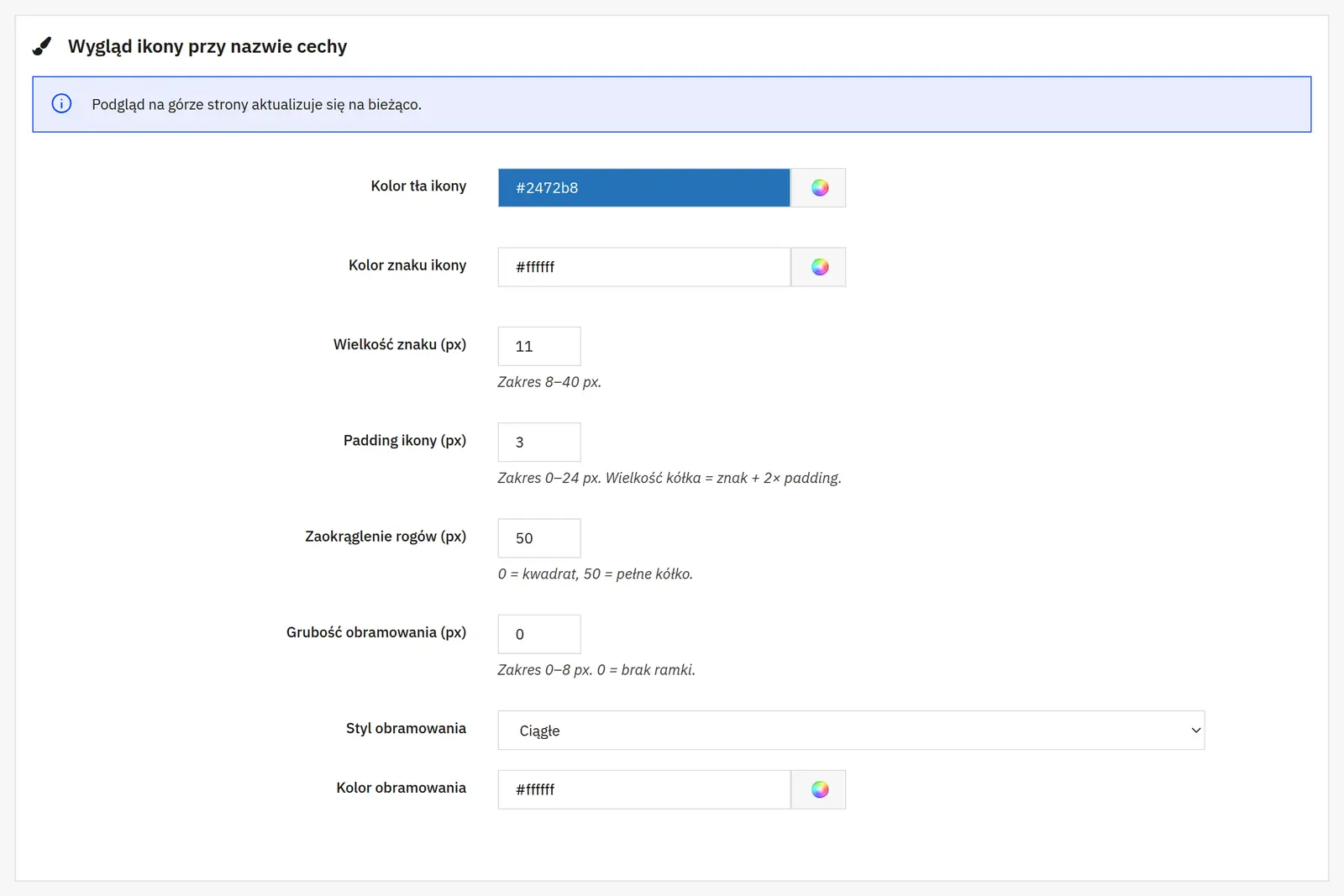
Full control over the look

Full control over the look

You set the style of the feature icons and the value icons separately: color, size, border, corner radius and position before or after the name. Tooltip color settings and a live preview are available as well.
Good behavior on touch

Good behavior on touch

The tooltip has a configurable automatic close on touch devices. The custom engine needs no additional front-end libraries.

Who is this module for?

It is most useful in technical and B2B stores and anywhere products have a lot of parameters that need a short explanation.

FAQ

Can the tooltip be different for every feature value?

Yes. Descriptions are supported both for the feature and for specific values.

Does the module work with the theme’s existing feature table?

Yes. The js mode can attach the icon to the existing table. Alternatively, the tab mode with its own rendering is available.

Can I change the look of the icons?

Yes. Color, size, border, radius and position are configurable separately for feature and value icons.
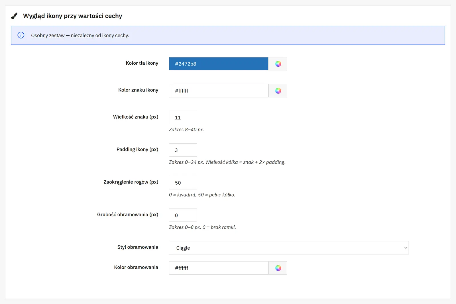
What can you set in the module panel?

Tooltip placement

01 / Tooltip placement

Tooltip placement

JS mode or a separate tab
The JS mode attaches icons to the existing feature table by text. A separate tab creates the module table and matches features by ID, without replacing the native table.
Tooltip on the name and on the value
Two independent switches decide whether you explain the parameter name, its value or both. For each icon you choose the position.
Tab title
Gives a name to the extra product tab. It is not used in the mode that attaches icons via JS.
Behavior and content

02 / Behavior and content

Behavior and content

Tooltip trigger
You choose how the tooltip opens. On touch devices it opens with a tap.
Automatic close on a phone
Sets how long the tooltip stays visible, in seconds. A value of 0 turns the timer off; the tooltip can be closed by tapping outside it.
Maximum width and HTML
The width limits the size of the tooltip. A separate switch allows HTML formatting; once it is off, descriptions are shown as plain text.
Tooltip appearance

03 / Tooltip appearance

Tooltip appearance

Icon character, size and padding
The character, for example i or ?, is independent of the theme’s icon libraries. The size sets the dimensions of the character, and the padding adds space around it.
Tooltip and icon colors
You choose the tooltip background, its text, the icon background and the character color separately.
Rounding and border
You set the shape of the corners as well as the border width, style and color. A width of 0 removes the border.
AJIT-FTOOLTIP

No customer reviews for the moment.

Related Products ( 4 other products in the same category )